
Better LinkedIn notifications
Clearing notifications is easier and more efficient
Priorities:
1) Make it easier to mark things as being read
As someone who has been searching for jobs on LinkedIn, getting notifications from job alerts is part of the process. However, it’s been a pain to mark them as read, since you have to actually click on them then go back to your notifications if you still want to scroll through them; if you have a lot popping up, this then becomes quite tedious. Consequently, I wanted to make it easier by bypassing a few stages of this process by giving job seekers a speedier option.
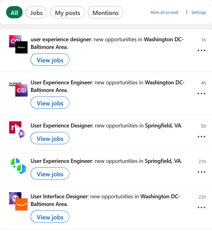

On the left is how the notifications feed looks after I made my changes to the header, with the image on the right being what it looks like with my update.
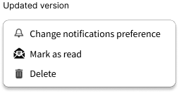
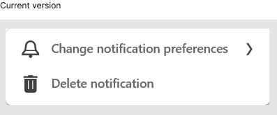
Another change I made was how the menu looks when you click on the three dots for the notifications themselves. The image on left is what currently exists, and it noticeably doesn’t have the option to be marked as read. My version fixes that, and the goal was to have it be all self-contained there.
I was tempted to completely remove “Change notification preferences” and leave it as an option in the header, but ultimately I didn’t want to make too many changes. However, I would want to do some A/B testing in the future with this.
2) Utilize empty space at top of options

This is what shows up when you click on your notifications when you log in to your homepage. Having the empty space to the right is an eyesore, and I was inspired to add options to not only occupy it, but to make things more user friendly.

Looking at how other sites incorporate these types of settings, I was able to then create two simple options for users. I purposely didn’t want to have them be set in a bubble, as I wanted them to be distinct in that way. The “Mark all as read” option would be somewhat redundant since users could click on the individual notifications, but this would also give them a shortcut in case they don’t want to do things piecemeal; the same goes for the “Settings” option.
Final remarks and thoughts
Overall, I didn’t want to change too much given how LinkedIn already has a decent UI. That being said, if I was to continue on with this, I’d further streamline options in the header for notifications: I’d make combine the “All”, “Jobs”, “My posts”, and “Mentions” into one list. Some A/B testing would also be needed to see if what I did is better, or if I need to change the way I approached this.
The challenge for this was also seeing how much I could emulate. In order to maintain the brand design, I did my best in Figma. I had to do a lot of copying and pasting of images, as I wasn’t sure if I would be able to 100% replicate things.