
How can I make a frozen custard store’s site more responsive?

Project overview
A local frozen custard store, The Dairy Godmother, has a site with responsiveness issues on top of needing a visual redesign.
Problem
Users had a difficult time navigating due to a non-responsive website and unclear UI (for both desktop and mobile).
Solution
Redesign the site’s UI as a whole, with a focus on condensing information to be more palatable.
Project details
Duration: Two months
Tool used: Figma, Google Meet
Challenges: Make the site more responsive that came with an overhaul of the aesthetics, without going outside the constraints of the simple branding that existed.
Design process
Research
Competitor analysis
Before I began, I did competitor analysis with five local stores, which are indirect competitors. They were all chosen for their relative proximity to The Dairy Godmother, as well as offering alternative choices for customers who were seeking frozen custard: this would give me a frame of reference for what other customers might expect. Once I had this, I then was able to move on to conduct my interviews.


User interviews
Summary of research: five people were interviewed online
Information to find during interviews
Ways to make the site more responsive
What aesthetic changes could be made to improve the site to be more attractive
These were the main questions asked to ascertain the redesign of the site; I wanted to get the basis down before making changes to the features later on. Once that was taken care of, I would then be able to apply the knowledge to something that would be more responsive.
Questions asked
-
What would turn you off from using one?
-
What do you like/dislike about the design?
-
If you like having images, what kind of ones do you prefer?
If images are presented, what would the ideal layout for them be?
-
Where would be the ideal place on the site for a menu?
Takeaways from interviews
The site was too bare bones/rudimentary.
Having the Flavor of the Day be the first thing you see was hailed as a positive.
There were too many tabs, which caused some confusion.
Too much text and not enough images
Responsiveness issue was something that was evident
Affinity mapping
Themes
Accessing site
General feedback/criticism
Menu design

Findings from analysis
Overall, site should be easier and nicer to look at
Tabs should be consolidated to be easier to access
Feedback possibly for later
The “Flavor Forecast” was generally liked, but some interviewees mentioned how making tweaks might optimize it
The color palette was mentioned as being okay enough, but adding an extra color or two would complement the existing ones
One person said that the site is “not the optimal way to display things, but it gives me what I need”
Define
Information before beginning
POV: A person who wants to get more information about the local frozen custard store.
HMW: How might we cut down the time needed to get to both the menu and the flavors, for new customers?
HMW: How might we balance the amount of text and images to make the site more responsive?
POV: A person who wants to be able to get more information to compare in regards to the frozen custard options.
HMW: How might we minimize the amount of clicks a customer could need in order to complete their goal?
I ultimately focused on the first POV statement, and I used the HMW statement of “how might we cut down the time needed to get to both the menu and the flavors, for new customers?”. By focusing on these two, I had a broader goal to work with. This also ensured that everything else, in the process of making the site responsive, would be covered.
Criteria for implementing feedback
50% of the interviewees needed to say the same thing
If under half of them brought up something, the idea would be saved or attempted to be used within a more important concept.
User persona

Christina was used a frame of reference for expanding on both the likes and dislikes, and I kept them in the back of my mind when making the changes. In particular, the clean aesthetic and the minimal amount of text were the points that I referred to.
User flow
Task: find information about the restaurant
By doing this, users would show the ease of the site’s navigation and thus give me a better idea for what to improve. As seen below, the user flow attests to how I streamlined my version, for both desktop and mobile. Given the simplicity of the site, I opted not to create a task flow.

Key findings
User flow was simple and easy to navigate.
Need to consolidate information from existing site to make it clearer what is important.
Design
Low-fidelity wireframes
The design process started with the fact that I knew I wasn’t going to reinvent the original site. I wanted to keep it as intact as possible, albeit with half of the tabs removed for the sake of clarity. One thing I did add for the homepage was a description of the Flavor of the Day, as that was part of the feedback I’d received—people would want to have a better idea of what it was, as the titles can be vague. With the Flavor Forecast page itself, I wanted to add some images here, since it not only would provide a better idea of what to expect, but it would ensure there wouldn’t be too much white space.
Goals for the low-fidelity design
Establish basis for the overall site
Clean up the number of tabs at the top
Provide a simplified source of information
Desktop version

I didn’t want to reinvent the wheel here, so I essentially emulated the existing site’s layout, but pared down the tabs at the top as well as adding the placement for the image of the flavor of the day.

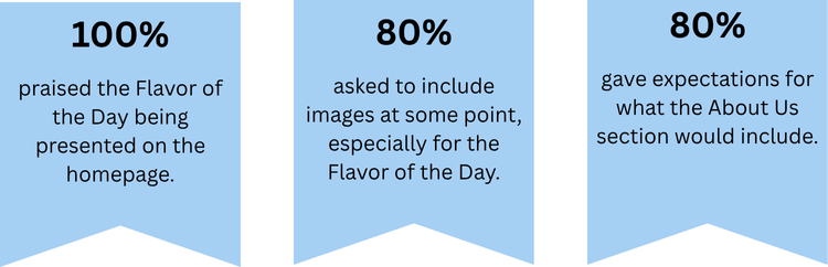
Per the previous round of feedback, I wanted to add a few images of the flavors, as one thing mentioned was that the descriptions were too vague. Additionally, I kept the Flavor Forecast chart as that was lauded by the interviewees.
Noteworthy feedback:
There was some confusion about whether or not “Flavor Forecast” (as the title of the tab) was the menu.

All this is is the Flavor Forecast chart enlarged, which would be from the previous page if a user clicked on it.
Noteworthy feedback:
Four of the five mentioned this tab as being something I would need to address, as they felt its purpose was a bit confusing.

I was playing around with how I wanted to do the “About Us” page, as about half of the interviewees mentioned they would like to know what exactly is frozen custard.
A secondary comment was that seeing “About Us” gave interviewees the expectation that something would be mentioned about the restaurant itself, hence why I initially had intended to have a brief explanation of them.
It was also mentioned that I should include images in order to make this particular page feel a bit livelier.

Here, I wanted to replicate the original site’s layout. However, I wanted to change the way the contact form was presented to make it cleaner and simpler to use.
Mobile version

I wanted to replicate the desktop homepage, but have it condensed. At the top right, the hamburger menu is where users would go to find the navigation options.

Same with the homepage, I wanted to keep the essence of the desktop version but in a more condensed version. The plan was to have the Flavor Forecast chart be clickable, whereupon users would be able to look at the enlarged version in a separate tab or be downloaded.
Note: “Flavor Forecast” was confused for being the menu.

Here, I planned to discard one of the images in order to concede that for the mobile version.
Noteworthy feedback from interviews
Feedback to use later
20% of interviewees mentioned adjusting the font to be more polished.
20% of interviewees suggested being able to scroll down the page with both the menu and the Flavor Forecast.
Twice the idea of merging the “About Us” section with the “Contact Us” pages were mentioned.
20% of interviewees liked having the address be at the bottom of the page.
Considerations for high-fidelity frames
Resize images
Work on how sections are named/presented: rename “Flavor Forecast” to “Menu”
Ensure responsiveness would be optimized
Style guide
I took the existing color schemes and logos and updated/expanded them; a neutral color was added to supplement the existing ones. The logo was also edited to be able to be condensed as well as being more professional-looking. Their secondary one (the circle) was taken into consideration but I was unable to find a way to incorporate it within the frames.

Prototyping and testing
Summary for user testing
Five people were interviewed
At this point, I was converging towards the final frames for submission. Because everything I had up to that point wasn’t complex, the goal had shifted towards the visual aspect of the project. This actually proved to be a bit trickier, since I knew I definitely wanted to add more things, but I wasn’t sure how much or where the limit was.
Testing the high-fidelity frames:
I conducted the interviews online, with different people compared to the previous round.
My primary goal was to see how responsive the changes from low to high-fidelity frames were.
Was I going in the right direction when it came to the aesthetics?
Using the feedback:
I took previous comments and used it to make it clearer what tab users are on.
I worked on the aesthetics to have less space, for a better visual experience.
High-fidelity frames


This is the enlarged version that people would see if they clicked on the Flavor Forecast chart.


Mobile version


Key findings from testing
Overall there was no confusion about the flow
Three said they wanted a better way to see what they selected
Four of them said they wanted to see more images to make the site more visually appealing
Three of them mentioned how the text in “What Is Frozen Custard?” could be improved by changing the order it was presented in, to emphasize what The Dairy Godmother does
Secondary findings from testing
Two mentioned how the section titles in the mobile version could be removed
Two suggested changing the “What Is Frozen Custard?” section to have text on the left and images on the right
Two mentioned the order form in the “Contact Us” section
Iterations made
Removed the colored frame around the flavor of the day image, in order to blend in better with the background.
Changed the font style to be larger and thus more visible.
Got rid of the section headers for the mobile version.
Kept the Flavor Forecast on the Menu page.
Changed the images in the What is Frozen Custard? page.
Fixed spacing issues with the text.

For the desktop homepage, I changed the image as well as discarding the text box for the description. This was followed by adding color to the text on top of placing a CTA button that takes users directly to the menu. Additionally, I shrunk the tabs page at the top and adjusted the pixel sizes accordingly for better readability.

The menu was literally expanded on, as I realized users would be able to scroll down the web page. As such, I posted the full version of the Flavor Forecast. Other changes, aside from the fixed tabs page, included the placement and resizing of the page description, as well as a drop-down menu when you hover over the eponymous tab; this gives users the chance to do some navigation on their own in a less-obtrusive manner.

I fixed the “What is Frozen Custard?” page to be more engaging, by splitting the text with the images; this was something that was mentioned in the user feedback. Other than that, I fixed the placement and sizing of the text.

I wanted to test to see if the contact section had the right spacing, but there was enough feedback to cause me to make some basic changes: I simply fixed the spacing of the text/headers, as well as making the submission button more accessible.

Going into this round of testing, I wasn’t quite sure how I wanted to incorporate the Flavor of the Day on the homepage; testing helped me conclusively settle on it. Three changes were made: 1) fixing the image/colors and adding a CTA button to be more vibrant, 2) adding a frame around the address (for both versions of the site), and 3) removing the page title at the top.

One recurring issue of mine was seeing if people would be able to understand the distinction between the menu, with its regular items, and the Flavor Forecast, which has the monthly specials. While this wasn’t included for my low-fidelity frames, I did try to add it to the high-fidelity version, so my goal here was to continue to get feedback on that. Ultimately I needed to remove the Flavor Forecast title to dispel the lingering confusion.
Apart from that, there were two other changes. The first was a fix to the text, both in regards to the weight and the location. The second change was the size of the Flavor Forecast: I kept the original size with the knowledge that customers would be able to zoom it and/or download it as needed.

Given how the existing site had issues with the responsiveness (the text would wrap around the images), my goal was to fix that and make something simpler. My version involved paring down the text by removing superfluous paragraphs, but it was necessary to see if I couldn’t do so in a better way than what I had: feedback was definitive that the text was still too wordy. So, as with the desktop version, I broke up the text to include images between paragraphs. What helped me with this redesign was knowing that people could scroll down, hence the elongated iteration.

Same with the desktop version, I wanted to evaluate how users felt regarding the spacing of the contact page. Ultimately, I had to work on the text sizes as my interviewees mentioned how they felt the sizes weren’t proportionate to the importance. Thus, I simply changed the spacing and size of the text/headers to fix the visual hierarchy, as well as making the submission button more accessible.
Final versions after iterations


Conclusion
The project was more complicated than anticipated at the start—the lack of complex elements gave me a false sense of security. I also saw how prominent each and every change I made was, as they stood out more compared to sites that have more going on; I had to ensure that nothing stuck out for the wrong reason. Fixing the responsive issues was easy, but that masked the difficulty of how the existing design could be overhauled to be more aesthetically pleasing for the customer.
Had I continued further, I would have added more images as well as making the menu options more interactive, which was something mentioned by less than half the interviewees.