Adding a feature
Expanding Duolingo’s grammar features
Project overview
Problems
Users do not have a comprehensive section to review grammar
Users do not have a chance to take what they’ve learned and practice it
Users lack the ability to use the community for help with their target language(s)
Duolingo has shifted away from presenting grammar/grammatical over the last several years, which has impacted user understanding and fluency with language learning.
Solution
Create a better hub for reviewing, as well as bringing back a community section
Project details
Duration: Two months
Tools used: Figma, Google Meet
Challenge: I was had to emulate Duolingo’s existing style while also ensuring I was able to add a sufficiently comprehensive grammar review section.
Design process
Research
Competitor analysis
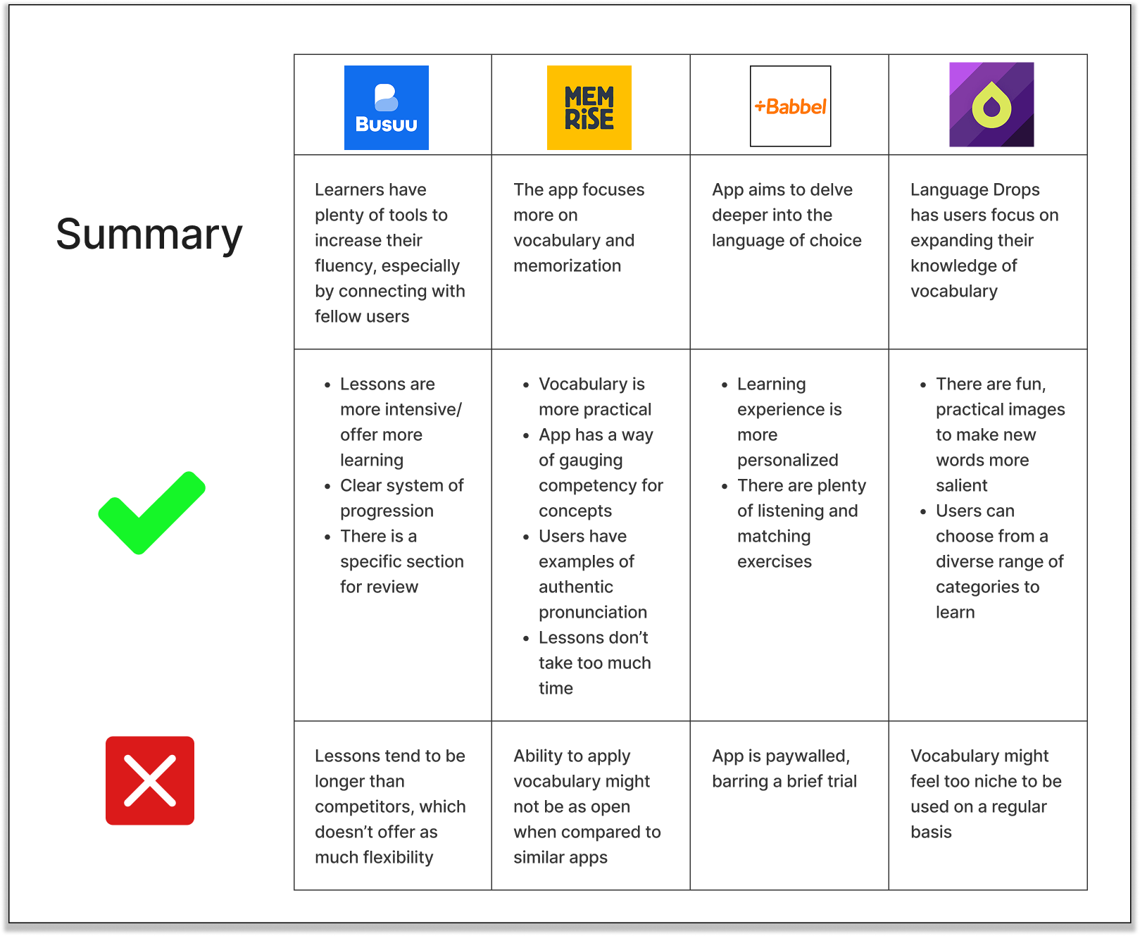
In order to get an idea for how I wanted to add the Grammar section, I took a look at a few other similar learning apps: they are ones that are the most direct competitors. While I had a style guide for Duolingo as well as having to design something similar to what users expect, having a larger frame of reference was what was needed to complete this project.
User interviews
Summary of research: Five people were interviewed online
Information to find during interviews:
What features would be needed for a section to review grammar
If there is anything else that could supplement this overall concept
For this point of the project, I wanted to gather thoughts about having this dedicated section for grammar, as well as understanding what would be the ideal presentation of it.
Questions asked
-
If you like it, what particularly stands out?
If not, what and how would you change it?
-
Is it clear about the progression between each one?
How satisfied are you afterwards?
-
What can you say about how it’s presented?
-
Did you feel you were given practical examples?
-
Would you want something more detailed?
Do you find yourself going back and reviewing the material? Do you do this within the app, or do you have to do so elsewhere?
-
If so, what aspects would be ideal for this? If not, why do you think so?
Takeaways from interviews
Four of the participants said they would like a dedicated section to grammar.
Four of them said they want to discuss things with other users.
They want to get feedback.
They want to be exposed to more colloquial language.
Existing explanations are “passable” and “routine”
One specific comment was, “I don’t think they teach grammar at all.”
The consensus for the explanations is to have a scaled level of difficulty.
Affinity mapping
Themes
Things to note for a future grammar page
Things for a hybrid grammar/community page
Things to think about for a community section
Findings from analysis
Lessons are fun yet useful.
Lessons don’t feel overwhelming, and are easily digestible.
There are a diverse set of exercises.
Feedback that might be used later
Two of them said how since they’d take the language in school, Duolingo’s lessons felt “routine”
One interviewee said they wanted to feel more involved with the community
Define
Information before beginning
The main issue interviewees had from their experience in Duolingo was how the grammar explanations weren’t clear enough, and it felt like the app paid lip service to them in favor of actual exercises. Additionally, the way lessons were set up meant that was hard to come back and find the “why” behind using certain concepts. Because of that, my focus shifted to not only expanding on the depth of explanations, but creating a hub where learners could come back to reference concepts that may have gotten buried along the way.
POV: A person who is frustrated by the lack of explanations for their experience
How might we expand on the way the explanations are presented, in order to remove the ambiguity that exists?
POV: A person who wants to take their skills to the next level
How might we create explanations and exercises that are able to be self-contained within Duolingo?
POV: A person who wants to be better connected with the language they’re learning
How might we provide extra levels of difficulty that can challenge users based on their preferences?
Criteria for implementing feedback
Half the interviewees needed to say the same thing
If under half of them brought up something, the idea would be saved or attempted to be used within a more important concept
User persona
With Joanna, I had a persona that I could refer back to for key points. In particular, she prefers being able to have lessons/sections being broken down into easily-digestible chunks that are presented in a fun way. She also places great importance on being able to understand the “why” behind the examples, which would naturally manifest in the form of practical exercises. I took all feedback into account, but it was beneficial to have tenets that I built out from; these helped influence the subsequent user flow.
Feature roadmap
Based on the feedback and the persona, I compiled a list of features with three categories of importance: must have, nice to have, and can come later. In order to take precedent, at least 60% of interviewees had to have said the same thing, and my threshold for being nice to have was 40%. Consequently, I was able to find what I prioritized, as reflected by the image below.
User flow
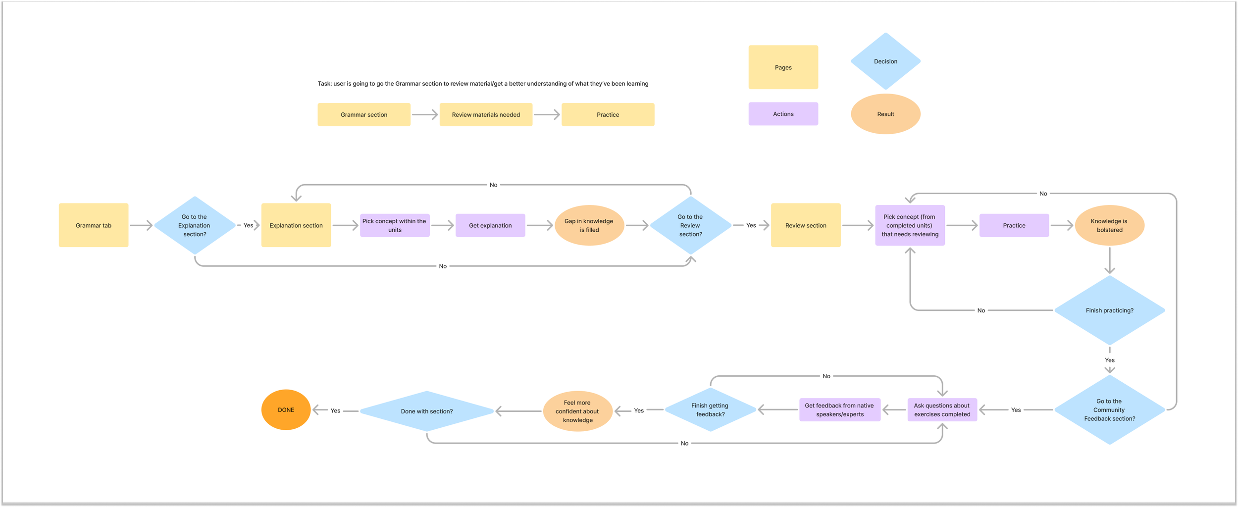
Task: user is going to go to the Grammar section to review material/get a better understanding of what they’ve been learning.
Design
Goals for the low-fidelity design
Replicate existing style
Create framework for overall feature
This part of the project was inspired by something Duolingo has—a section to review mistakes and vocabulary. However, it should be said that this is for premium users, whereas my project would be open to all users. While I would be doing something different, I had the challenge of creating something that replicated the existing style.
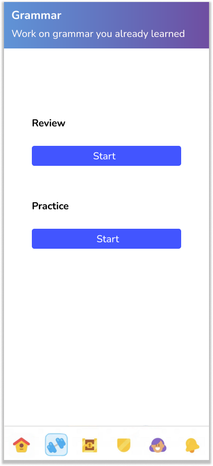
Users would click the icon at the bottom (which is what Duolingo does) to be taken to this Grammar section.
Users would be presented with the options to 1) go over explanations of the concepts, or 2) do practice lessons with these concepts.
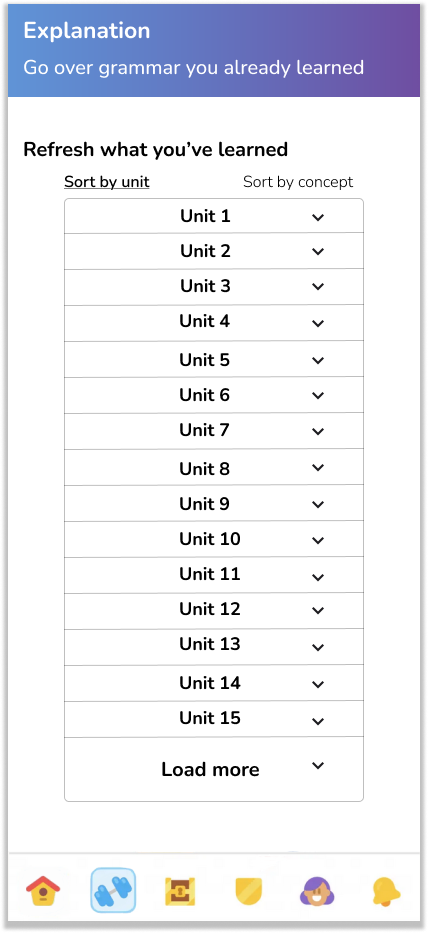
If the option to go over explanations is chosen, they would see a list of everything they’ve gone over to that point in their course.
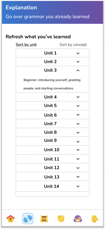
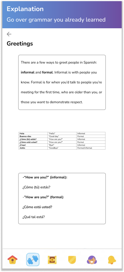
Once users click on a specific concept, they would be taken to the next page that goes into more detail.
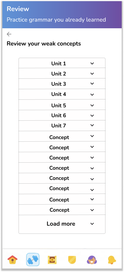
If users choose to do practice, they would have a similar screen compared to the explanations.
On the left is the Explanation section, where users would be able to go back and refresh their memories on the topics they’ve covered up through the current one in their course.
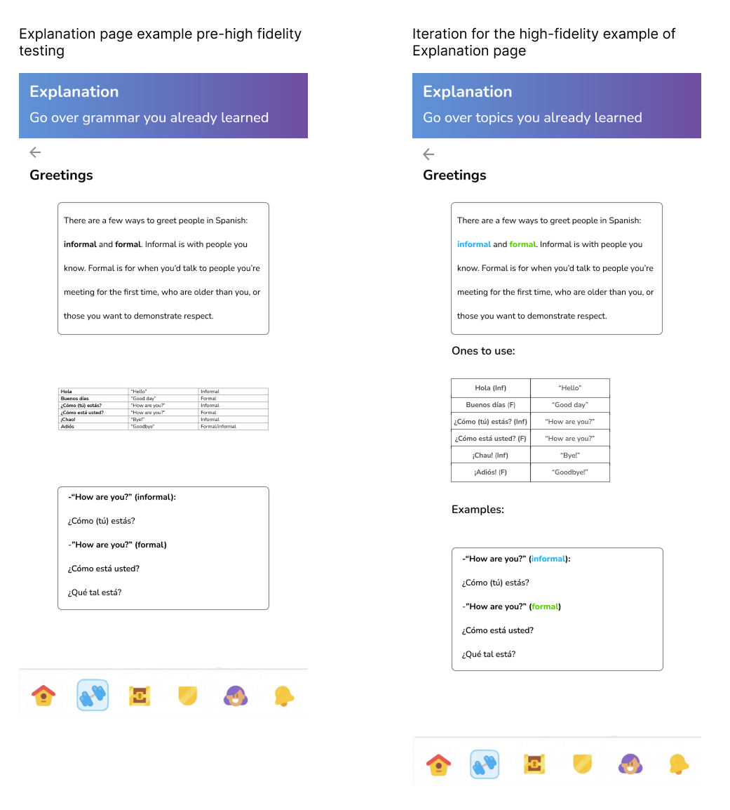
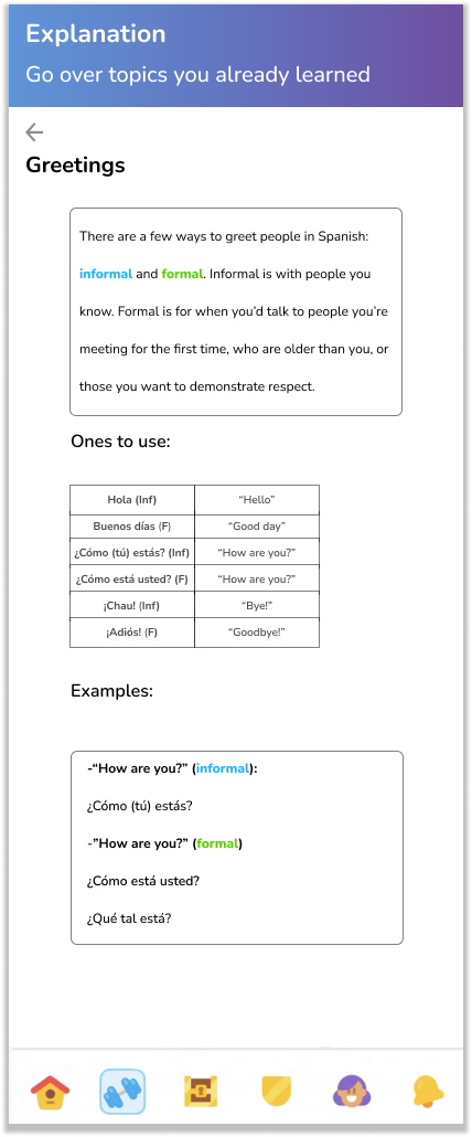
On the right is the example of how things would look once a topic is selected: there would be an overview, followed by a visual and then examples to reinforce the concept.
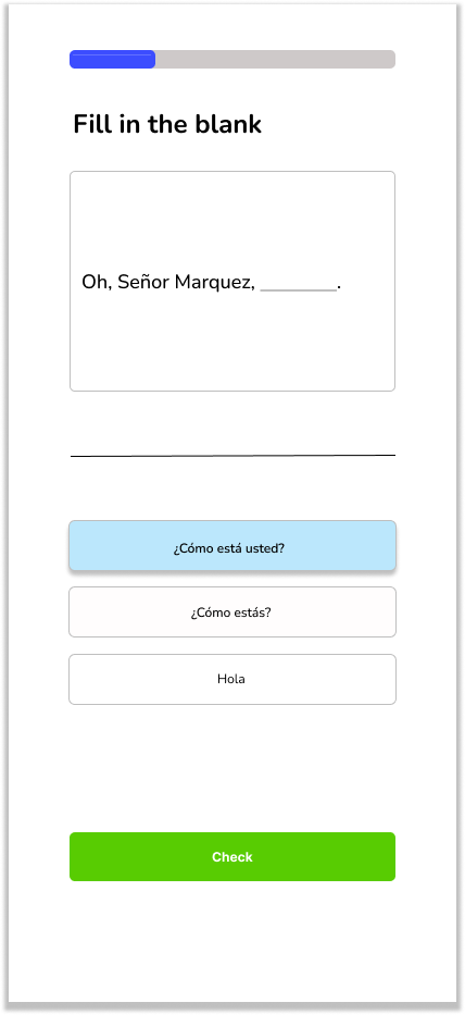
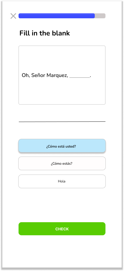
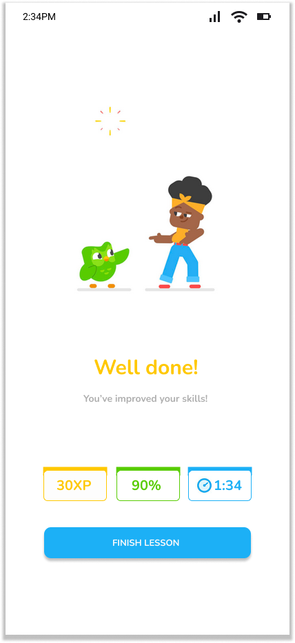
These three screens are the Review section, which is where users would go if they wanted to actually practice the topics. From left to right: the page for it, an example of a review question, and the completion of the lesson.
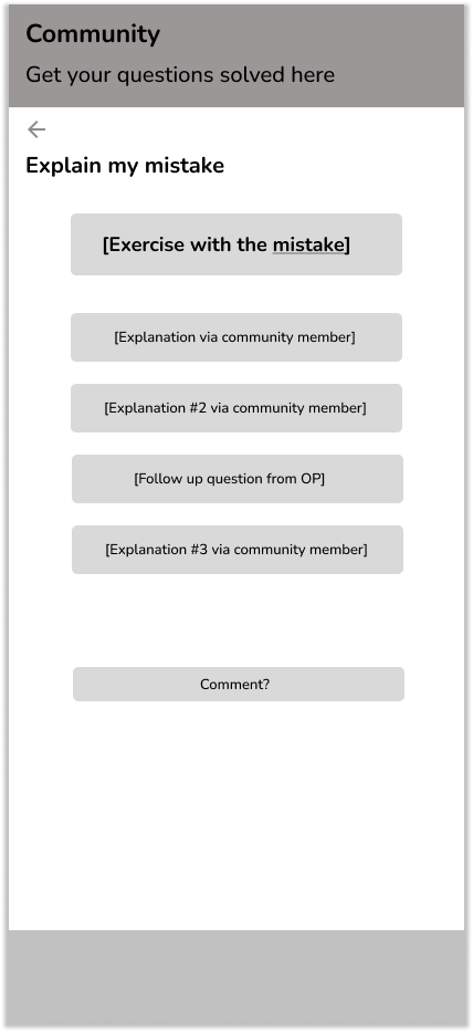
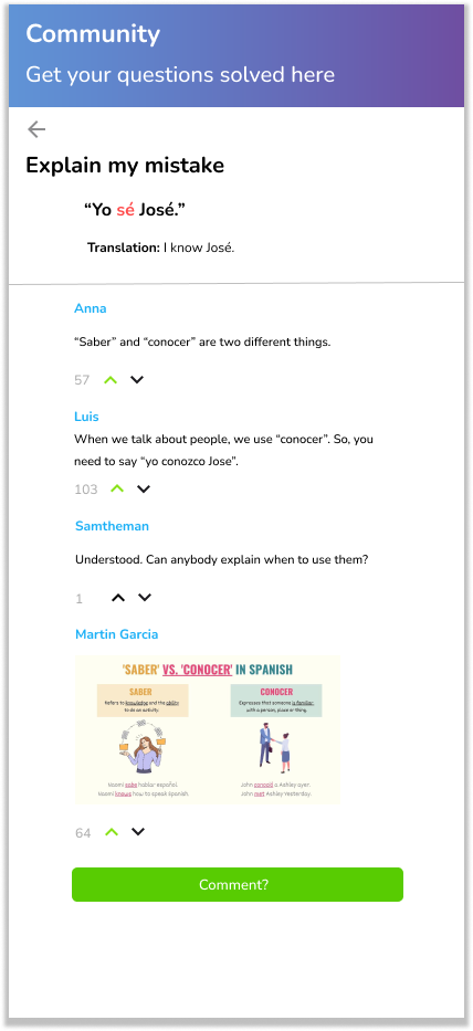
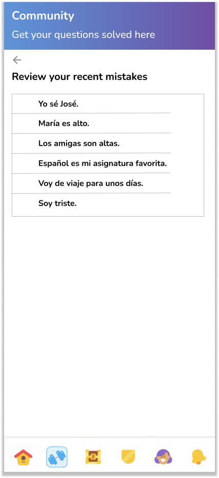
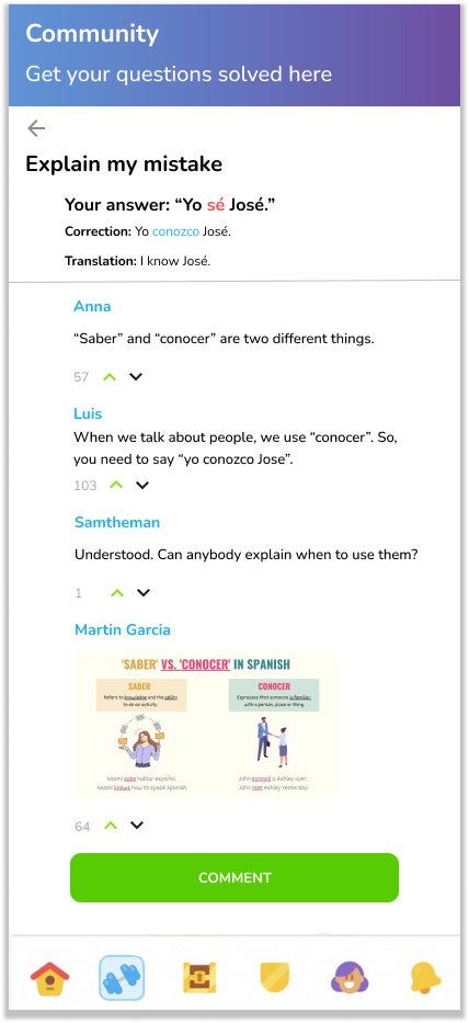
Finally, this is the Community section, where users would be able to get feedback from fellow users. This was borne out of feedback saying they wished Duolingo did more to develop a communal feeling, as well as being my take on a similar section they had as recently as two years ago.

Noteworthy feedback from interviews
Considerations for the high-fidelity frames
Add a few more things to supplement the existing ideas.
Ensure visual consistency with Duolingo’s existing style.
Make sure the buttons are clear and have a purpose.
Prototyping and testing
Summary of testing: Six people were interviewed
At this point I had a very good idea of what I needed to do, and what I expected to hear back about. This meant that I was able to ask specific questions for my six participants, which gave me plenty of useful feedback to make changes.
Testing the high-fidelity frames
Interviews were conducted online, with participants guessing what they needed to click on.
Interviewees were asked what they thought they needed to click on, as well as what they would recommend having.
Overall they said sections should be renamed to avoid confusing users.
They unanimously said the arrows needed to be changed.
Feedback was that they expected to have dropdown menus/dropdown menus that functioned in a different way than I had intended.
Using the feedback
There was a better idea for what both the Review and Practice sections needed within this overall Grammar section.
There were no issues with the overall flow, so it was confirmation that the focus could move on the sections themselves.
I did need to make a few tweaks with going back and forth between the frames, but these were relatively minor.
Note: I used Duolingo’s color palette as well as the placement for the features, as I was emulating everything I could for the sake of immersion.

High-fidelity frames
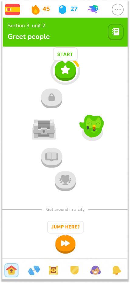
At the far left is the homepage and the icons underneath, where users would click on to get to the Grammar page. Next to it is the Grammar hub, with the two options for users. The next two images on the right are respectfully what the list of concepts look like and the expanded description for said concepts. Finally, the rightmost image is the example of what the explanations would look like.
Starting from the far left is the Review part of this overall section, where users would have a clickable button for the concepts the app acknowledges as being weaker. On the second from the left is the what the questions look like once users have started their practice. To its right is the page once users finish their round of practice, and this the standard in Duolingo after every completed lesson. Finally, the rightmost image is the example of what the planned Community section would look like: users would be able to ask for help from others as a way of getting immediate help.
Key findings from testing
The flow was unanimously described as being simple and okay.
The majority of the participants said there needed to be an overhaul of the layout for “Review” and “Practice”.
Three of the six said they expected to see more familiar things, in regards to Duolingo’s style.
Five mentioned the titles of “Review” and “Practice”.
All six mentioned needing something to take them to the next sections.
Secondary findings from testing
Two of them suggested having a different color to indicate/highlight selected items.
Two mentioned how the corners of the boxes didn’t look like how Duolingo has them.
One of them expressed surprise at being taken directly back to the “Review” section upon completing a review lesson.
Iterations made
Made the “Review” and “Practice” functions more distinct.
Improved the flow to be better and simpler.
Renamed “Review” to “Explanation” in order to ensure users had a noticeable distinction between sections.
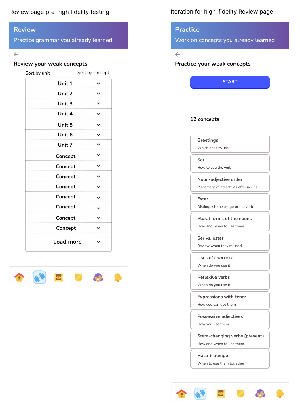
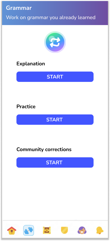
There was some confusion at the title of the sections, so I wanted to ensure that wouldn’t be the case when iterated upon. Aside from that, I added the third option of going to the “community corrections”, as well making the buttons rounder to align with how Duolingo has them.
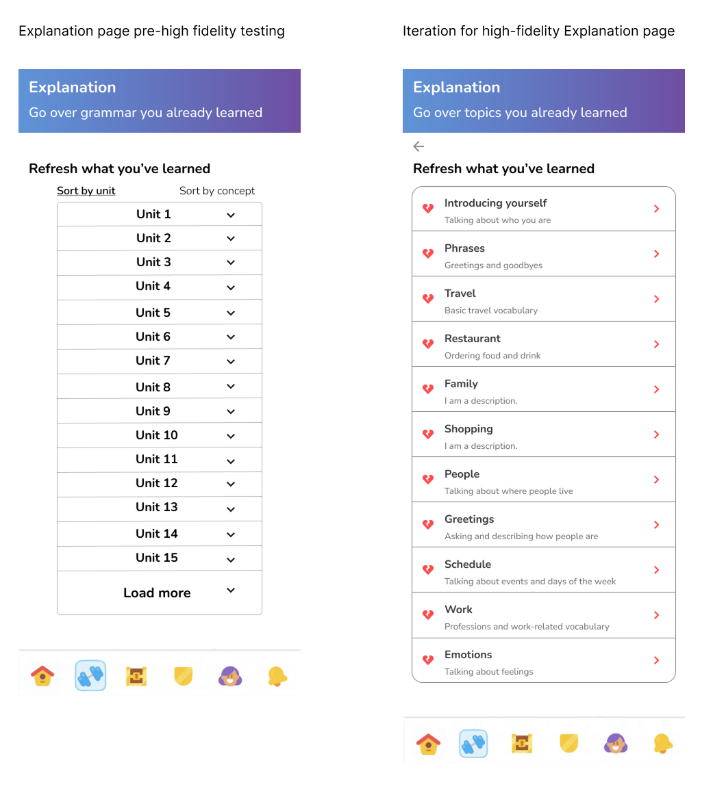
Going into testing, I wasn’t quite sure how I wanted to present the way users could find/access the previously learned material, so I focused on getting feedback for that. Responses also indicated that the function of the arrows were confusing and might have implied some other functions, so I used that when making the changes. As a result, I took the existing style of the app’s review section and applied it to the explanations for a cleaner and more intuitive look.
The chart in the middle was fixed to match Duolingo’s style, as well as having a bit of color added to distinguish the formal and informal terms in this section. It was a challenge to find a way to condense said chart without neglecting information nor shifting away from the existing style, but ultimately the final product was appreciated.
The first thing I did was rename the section to “Practice”, to alleviate the confusion interviewees had. As with the Explanation section, I changed the design to be easily understood while maintaining the existing aesthetic of the app. The only difference here was that I gave users the chance to go directly into practicing these concepts, which is reminiscent of an existing function.
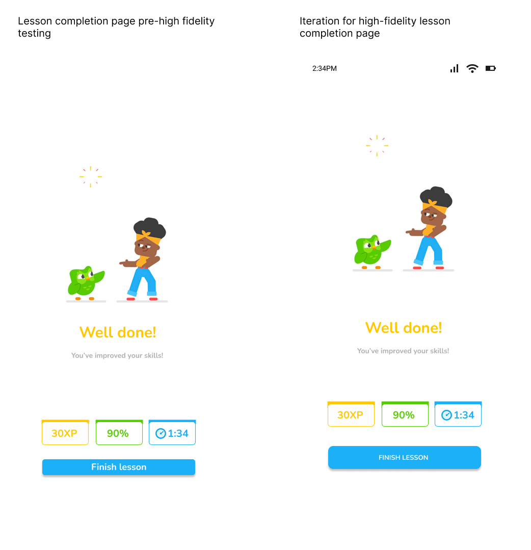
I added icons to replicate what it would look like on phones, as well as fixing the “finish lesson” button and addressing the spacing of the images. While minor, feedback from testing focused on how the action button might not be as accessible being that small size, in addition to being that far down on the page.
Final version
App and Grammar section homepages
Explanation homepage and example of a topic.
Practice section and example of a lesson with the completion frame.
Community homepage and an example
Conclusion
Adding this Grammar feature to Duolingo was not inherently difficult, but doing so while maintaining the expectation of their existing style and aesthetic was the challenge I faced. I was able to push the boundaries a little but, but given the set of parameters in front of me, I ultimately did not reinvent the wheel.
For a continuation of this project, I would focus on expanding each of the sections to be more comprehensive, as well as improving the flow to be smoother.

