
Designing a language learning app
An end-to-end project that gives users everything they need to make clear progress
Project background
Language apps don’t offer a sense of comprehensive (i.e. reading, listening, and speaking) lessons and features that make one feel like they’ve truly been learning.
Problems
Language learners don’t have enough features to advance their linguistic skills.
Current apps don’t always it intuitive to both find and use these features.
Solution
Create a comprehensive and intuitive app that ensures users have everything they need
Project details
Duration: Two months
Tools used: Figma, Google Meet
Challenge: Create everything about this app, from start to finish.
Design process
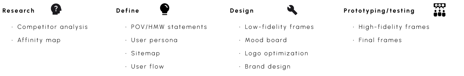
Research
Competitive analysis
I needed to get an understanding for what already exists on the market, so I analyzed three of the most cited competitors: Duolingo, Busuu, and Memrise. By doing so, I was able to take the best aspects and use them for my own.

User interviews
Summary of research: Five people were interviewed online.
Information to find during interviews:
What language learning apps the interviewees use.
What they like about them.
What they would want to see added.
In order to ascertain who the audience is and what issues they’re facing, I asked these three questions, with some follow-up questions in order to be as thorough as possible. Once that was over, I was able to take the information and find some common things that helped me to create something that reflected what the average user could use. The affinity map shows the results of these five interviews, which did not contain any major surprises.
Questions asked
-
Could you explain why it’s the best app for you?
Have you used other apps?
What helps you learn the most with it?
-
What keeps you engaged?
What would cause you to want to spend more time with it?
-
If you had to change it, what would you do?
-
If yes, could you explain why? If no, what do you think you would have to do to be prepared?
-
If so, would you prefer more audio examples, or more conversations with native speakers?
Takeaways from interviews
Users want something that is clean yet interesting.
Users want to have a customized experience where they feel that the app pays attention to their goals and mistakes.
Constantly being stimulated while using their apps is what keeps them motivated.
They want a comprehensive overall experience/something that challenges them.
Affinity mapping
Themes
General feedback/criticism
Design
Features
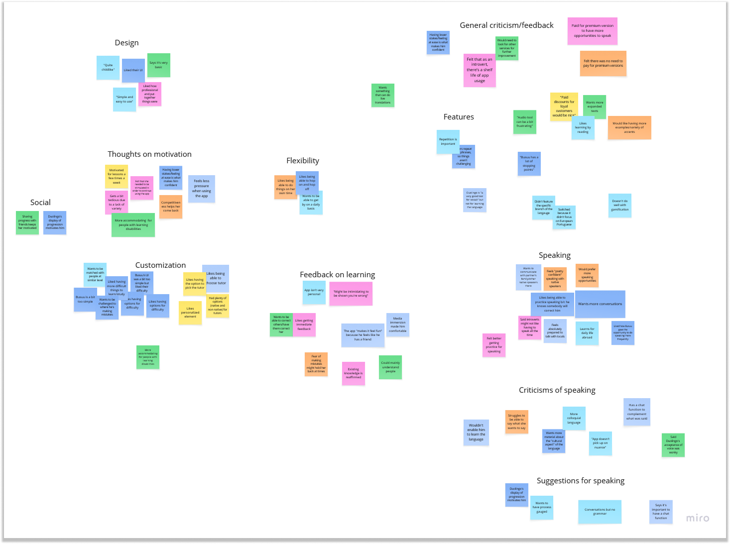
Findings from analysis
Lessons are practical and they cater to the user.
Lessons aren’t overwhelming.
The user has plenty of tools to use.
Define
Information before beginning
Interviewees unanimously cited how they never felt confident that they were making progress, so having indicators of that was key for this project. Because of that, I wanted to ask how I could facilitate that with the creation of certain features.
POV: A person committed to learning a new language via an app needs to be able to see they’re making clear progress in all aspects.
HMW: How might we deliver a balanced learning experience for learners striving to advance in a new language?
Criteria for implementing feedback
Half the interviewees needed to say the same thing.
If less than half of them brought up something, the idea would be saved or attempted to be used within a more important concept.
User persona

Due to the scale of this project, having the persona of Sienna helped me pinpoint what it was that I needed to do, and it definitely supplemented my own thoughts on creating this app. There were two main points that especially provided guidance: no time restraints for learning and practicing those concepts, and being frustrated by a lack of clarity about the exercises she’s doing. Because she was the amalgamation of feedback and the average user, I was able to proceed accordingly when designing.
Feature roadmap
I used the persona, as well as the POV/HMW questions and feedback, to create the list of features I needed sorted by levels of importance: must have, nice to have, and can come later. At least 60% of interviewees had to have said the same thing in order to take precedence, and below that the threshold for being nice to have was 40%. The image below is the summary of these categories.

Sitemap
After Sienna, the app’s flows were established, with the intent to be straightforward; the first round of interviews had mentioned that this was something vital for every language learner. I envisioned a hub where users would be able to branch out to the features they needed at that particular time. The sitemap here shows the simplicity of it, with the user flow underneath it--I spent time ensuring both processes wouldn’t be overwhelming.

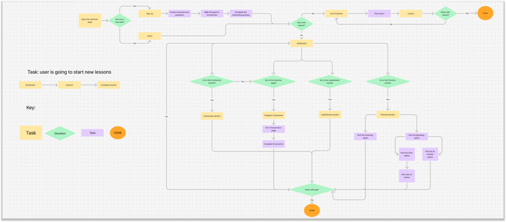
User flow
Task: the user is going to start new lessons.
I wanted to get testing for this, in order to see how easy it was for users to pick up the app and find what they needed to do; this would be a referendum on my design to this point. Additionally, the presence of other features meant that there might have been some confusion about what to press, so that was a secondary focus for this flow.
Design
Goals for the low fidelity design
Create the framework for the app.
Develop something familiar to users.
For this part of the project, I opted to bypass sketching my ideas and went straight into designing. What helped me come up with my low-fidelity frames was how I used both Duolingo and Busuu as a basis. In particular, I used their flows and UI as a frame of reference, especially when it came to the features they’re known for. Given how I wasn’t beholden to any existing structure, I was able to take the best aspects and add the prior feedback to make something unique.


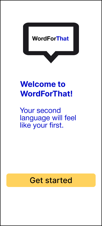
This was the preliminary starting page that would greet users the very first time they open the app. The middle image is what users would select once they get started, and the image on the right is another task they would complete in order to set up their profiles.

I wanted to have a hub for users once they’re in the app, which is what the image on the left is; it was inspired by similar apps. At the top are the usual icons: the language they’re learning, the daily learning streak indicator, the amount of experience per their daily goal, and the notifications. Once users click on the topic they want to study, they would go to the page (in the middle) where they could see a specific breakdown of the unit itself, with a progress bar to help guide them. Finally, the lessons themselves would look something to the frame on the right.

Here is the league board (L) and the user profile (R). As I included the league within the icons at the top, I needed to have something that reflected that fact for users; I did use Duolingo and Busuu as a basis for creating this. Once you’re in the leaderboard, or even on the main page, you could click to see who you are/who somebody else is and what language(s) they speak and what they’re learning. In addition to that, there would be a fluency chart to indicate progress, which is something that was brought up in user interviews as being a motivating factor.

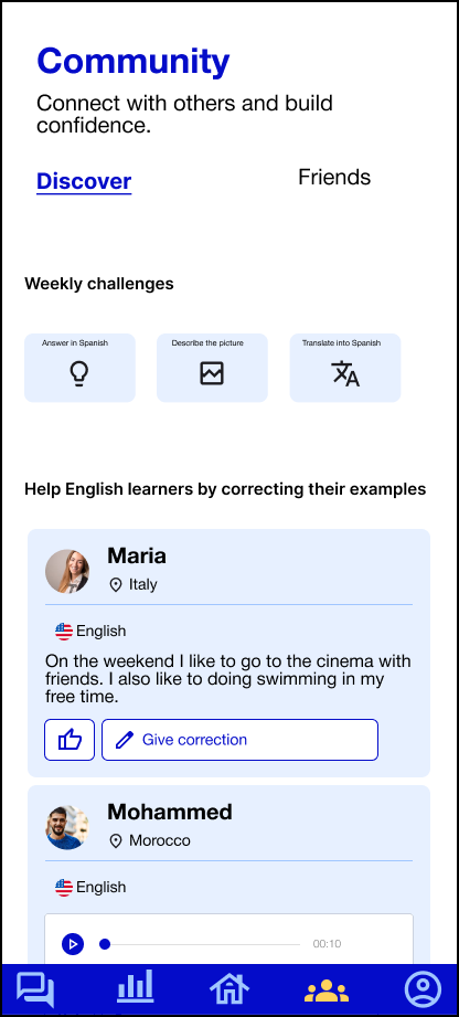
This is my idea for the Community section, where it would serve as a place to help give others feedback. On the left is where users could correct exercises of random people, as well as doing quick exercises of their own. Whereas on the right, this is where you would be able to focus specifically on what your friends have been doing.

This was my first attempt at creating the Review section, which is where users could see all the material they’ve completed up to their current lesson and go over them again. The image on the left is what I envisioned for the vocabulary component, since the idea of this project would be to offer a service for users to have specific words under their belt. With the two images on the right, I had to conduct A/B testing in my interviews to see which version of the grammar component would work best here: they ultimately chose the rightmost one, as they felt it was aesthetically and functionally better.

Finally, this was the last section of the app: the Practice section, specifically focusing on speaking and listening. I wanted to include this because feedback from the interviews mentioned how they felt most apps neglected these two parts of language learning. Coming up with the option to use AI to speak with was born out of the fact that three of the five participants brought this up, and it made sense to include that there. Otherwise, I went with the choice to choose a tutor, who’d be one of your app friends or a native speaker selected at random from the community.
Some things to note
Out of all features that were included in the final version, the Speaking section is the only one not shown here; I wanted to have the basic outline down before adding more for this set of frames.
For this iteration, I downsized to a custom size for the frames, since Figma’s Android ones were too big.
Considerations for high-fidelity frames
A clearer visual identity.
An expanded onboarding process.
Clearer distinction for the app’s homepage (once onboarded) regarding the unit pages themselves.
Add all planned features.
Pick the choice for the Review section component (that presented topics within a defined, clickable option).

Noteworthy feedback from interviews
Mood board
I wanted vibrant colors that kept users entertained as they learned.
I wanted something that was fun without sacrificing the learning aspect.
The style needed to be distinct.
Functions of the app had to be conducive to the learning experience as much as possible.

Brand design
The name WordForThat, as well as the logo, was chosen to signal its intent to help users with vocabulary.
A palette that reflected the calm and cool nature of learning, hence blue being chosen as the main color.
I wanted a refined logo that would reflect the no-frills attitude the app was taking.
Iconography was inspired by the competitors, but also are unique and simple to help users easily get to their tasks.
Buttons were designed to be as obvious in function as possible.
Logo optimization
I wanted to ensure that no matter what version of the app is being used, the logo would be optimized for it.

Parts of iconography
Logo
Typography set
Colors
Buttons: used for selecting items
Iconography:
These are the icons used to get to certain sections or indicate a feature.
Information for profile
This is what users would see when clicking on either their or somebody else’s profile.
Indicators of progress
Both the progress bar and the pie chart are ways for the user to measure how much they’ve done with their course/unit/lesson.
Summary of testing: Six people were interviewed regarding the high-fidelity wireframes. None of them had previously participated. All but one had prior experience with language learning apps.
Testing the high-fidelity frames
I conducted online interviews and walked participants through the flow.
-I did explain the general ideas behind the frames and then had them give feedback about three things:
What they thought about the flow.
What they expected to see/be able to click on.
With these two, I prioritized making something complex for users so they’d stick around but without sacrificing the ease of usage.
What they thought about the visual designs.
-Was the feedback (from affinity mapping) of “a visually pleasing app helps retain users” still accurate?
I wanted to assured I wasn’t neglecting that aspect.
-Interviewees were asked how features could be made more distinct.
Follow up: indications they would need if they wanted to delve deeper into each of the features.
Using the feedback:
I was better able to see what might have been overlooked when I was updating it from the low-fidelity frames.
-Vitally, I was able to see where the confusion with the icons and what frames they were connected to was.
The flow itself was unanimously described as being smooth
-I was able to simply focus on the aesthetics.
Prototyping and testing
High-fidelity frames


Key findings from testing
The flow was unanimously described as being simple and intuitive.
Five out of the six mentioned the profile page
Three times the leaderboard came up.


Recommendations received
Fix the empty white space to avoid having a distraction.
Make the purpose of the icons and headers clearer.
Iterations made
Expanded the introduction section to give clickable options.
Made the onboarding aspect more distinct.
Made overall visual component (icons, selected/non-selected options, and buttons) clearer and more distinct.
Made Community section tidier, with regards to aesthetics and layout.

For the dashboard, I fixed the spacing issue as well as changing the streak icon to reflect a lesson has been completed, on top of changing the way the “home” icon is presented underneath.

With the lessons themselves, I wanted to see how the alignment might affect user experience. The consensus was that the UI was fine, albeit bare-bones and slightly hard to see.
Consequently, I fixed the selected state for the answer, based on the color palate I established. I additionally changed the shape of the options to meet the standards I establish for buttons, while being higher up for ease of access. Finally, I removed the icons at the bottom as they wouldn’t be necessary for this function.


Ensuring the leaderboard felt comprehensive was what I wanted to test, and feedback received told me that I simply needed to elongate it for easier scrolling. The second piece of feedback was that it should be clearer where a user was on it.

This was something I felt insecure about, as it felt too empty/like it was missing something. Per feedback, I had to make two changes: make the presented information on the profile to be more positive, and fix the colors match the overall palette. For the former, I included the stats underneath the progress report to reflect the fact that there would be a system of giving/receiving corrections.

I wanted to gain feedback about what testers thought about the spacing, for both the presentation as well as the user examples. What I learned was that I did need to clean up the exercises from the other users and put it into an easier frame, on top of working on the spacing to be more reasonable.
Similar to the “Discover” page in the Community section, I wanted to get an idea for how I could organize the exercises from users. Based upon the feedback, I had to clean up how the exercises were presented. The difference here is that users would be able to scroll down a finite amount to see all their friends who’re learning their native language.

When conducting tests, I asked my participants if they felt there was the right amount of spacing and padding here. Taking their feedback into account, the info graphic was moved down to be more presentable, especially to accommodate the progress bar that was suggested. The last change made was for the footer at the bottom, to be appear more seamless and natural.
Final version


Conclusion
Overall, the project wasn’t as difficult as I might have anticipated. Having an extensive experience in using a variety of language learning apps enabled me to form the basis of my designs, which were then honed by the interviews conducted for the research and prototyping phases without having to make major changes. There admittedly were times when I had to step back a bit in order to think about how I could ensure that the majority of users would come away with the optimal learning experience, and that was the main challenge. Some functions also ended up being scaled down compared to the original plan, as it was what was needed in order to achieve the goal of delivering a quality experience.
With all that in mind, if I had continued on with this project, I would prioritize expanding the functions as well as incorporating some of the helpful feedback that wasn’t quite a majority consensus.