Dustid: overhauling an app’s onboarding process
Updates to attract and retain new users
Project overview
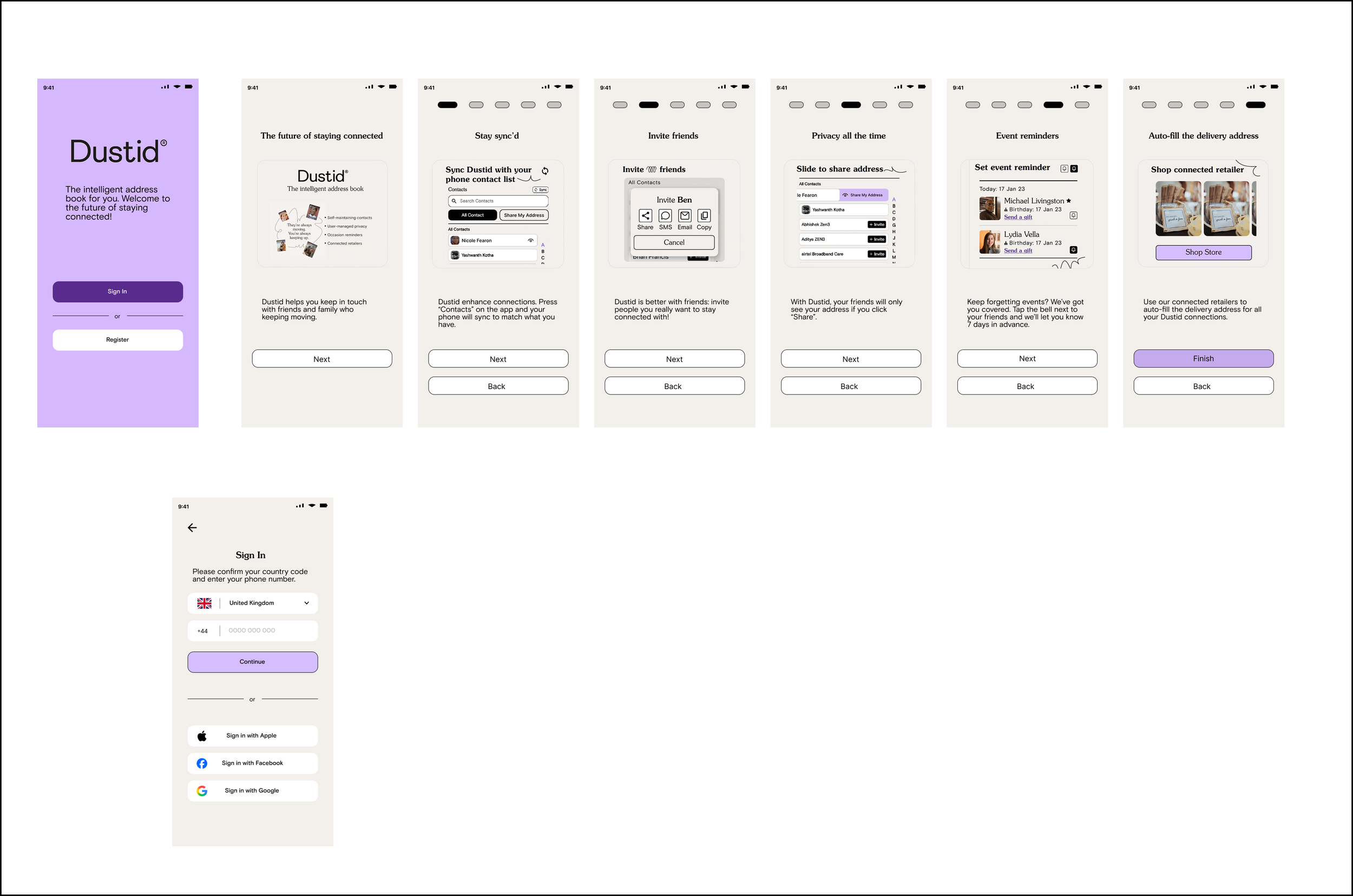
As a volunteer, my task was to take the existing onboarding frames and to improve and change them to become more modern and cleaner.
Challenge
Keep the essence of the app Dustid while modernizing its appearance, in order to be marketed to a wider user base.
Project details
Duration: January-February 2026
Tools used: Figma, GIMP photo editing software, ChatGPT
Challenges: Lack of references/icons, no existing user feedback to work with
First draft
Going into this project, I had a call with the founder of the app. He told me that he wanted to first minimize the amount of frames users had to swipe through just to get started. The second thing mentioned was how he wanted a less-cluttered onboarding process.
Before I could begin, he sent me a clipped video of what the process currently looked like. As seen below, this is what I had to work with as a reference.
With that in mind, I was able to come up with a first draft. Going in I knew I wanted to cut down the amount of frames a user would see to the bare minimum that it would take to show all features. I did want to move the progress dots to the top, as it would alleviate the issue of having to focus on multiple things at the bottom.
Key things for this first iteration: I wasn’t given any parameters about how to proceed at this point.
Feedback received
While I was told what I came up with was good, it wasn’t exactly what was wanted:
“At the moment, what you've shared feels too close to the existing screens. As I flagged during our conversation, a key priority was to make fuller use of the slide real estate to elevate the storytelling and impact.”
He then shared an AI-generated image that was more in line with what he was thinking of, and moving forward I used that as a basis.
Steps for next iteration
Focus on engaging UX/UI
Design something that wasn’t too close to the app’s existing screens
Elevate the storytelling and impact via maximizing the frames’ space
Increase the size of the images
Get peoples’ attention so they can skim the information
Second draft
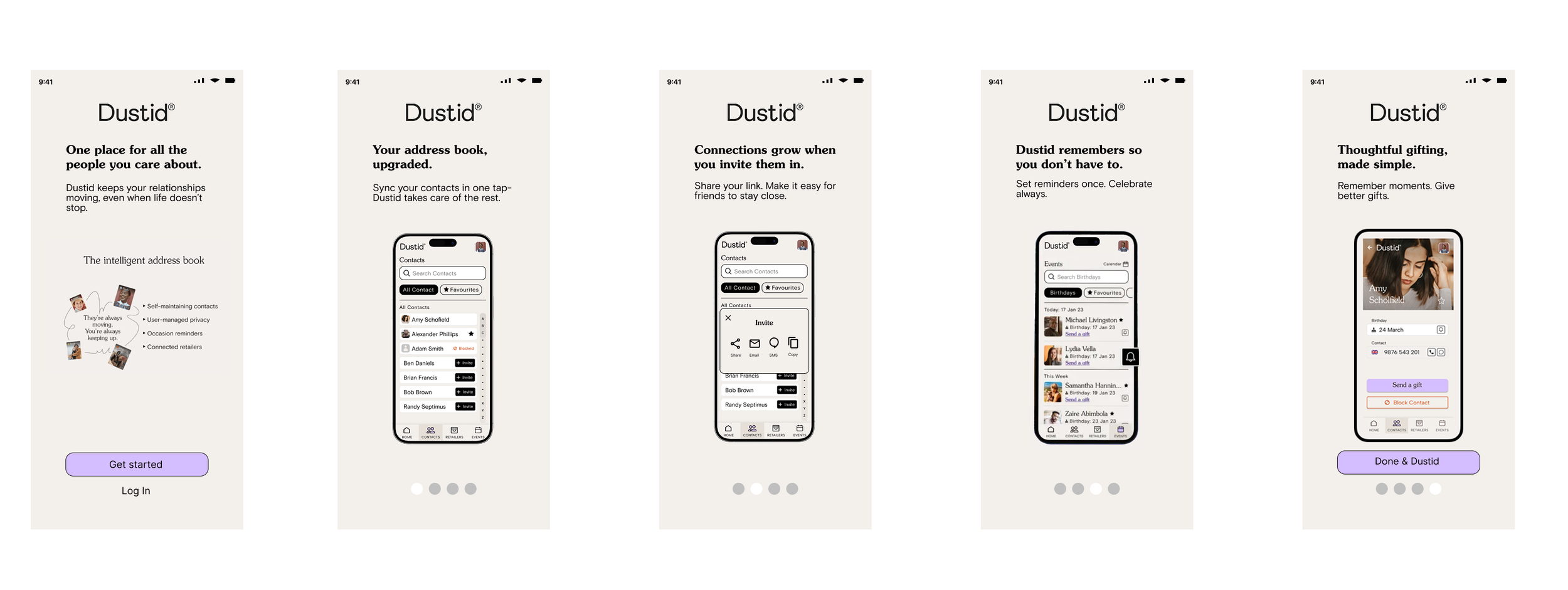
Completing this took about half a week, as I had a good basis to work with. I did have to request more reference images for this, but they were given and as such were greatly beneficial. Between the first draft and now, I additionally received an AI-generated set of images that helped point me in the right direction; this was on top of what I was able to generate, using ChatGPT.
Changes made
Removed two redundant screens in order to ensure onboarding was easier.
Removed the “Next” button to clear up space.
Moved the text to the top to be more clearer and easier to read.
Text was also fixed to be more concise.
Third draft
In the grand scheme of things, this iteration didn’t reinvent too much, only the last few screens themselves. Additionally, the project lead requested a change in the buttons as well as utilizing the space more.
Changes made
Added a sixth frame to inform users of the Gifting aspect.
Changed the buttons on fifth and sixth frames to make it easier to select functions.
Overhauled the icons in both the buttons and the footer to fit in with the aesthetics.
Final version and thoughts
The last change I had to do before submitting it was to highlight the “Share my address” and “Send a gift” features, which involved graying out the frames. I had initially highlighted the features with an orange outline, but after feedback we realized it felt out of place given the style of Dustid. Hence, going with something that didn’t look out of place.
If I continued on with this or had to restart it, I’d definitely see what the user feedback would tell me, as I did this project without any of that. On top of that, I had to do my best in replicating the screens that were available on both Google Play and the Apple Store, since I wasn’t provided with anything: I would create the screens completely from scratch instead of emulating them.


