
Creating an app for students to get involved with the environment
A real-world challenge addressed in a small team
Project overview
A team of five volunteers is working together to create an app, from the ground up, to engage and inspire students from 6-12th grade to get involved with taking care of the environment.
Challenge
Create an app that engages and inspires students to do more to advance environmentally-friendly tasks.
Project details
Duration: August-December 2025 (Phase One)
Tool used: Figma
Challenges: Being cognizant of a wider range of ages as well as priorities for a potential app such as this.
Phase one
Before we began, we were given four user personas to synthesize and use as starting points; this was conducted by a third party, and we had no influence over what was asked.
User personas
Without knowing how the interviews were conducted nor the questions asked, the team was provided with four user personas. These came to be a 6th, 8th, 10th, and 12th grader, with an equal divide between boys and girls.


Takeaway from the personas
There were four themes that they all shared:
Interest in environmental or social impact
-HHW: How might we make them feel that they’re able to make a difference?
-HMW: How might we deliver an experience that caters to a wider range of ages?
A desire for recognition and/or achievement
-HMW: How might we develop a system of positive feedback for them?
-HMW: How might we develop the app in a way that enables their progress be seen by other people outside the app?
Digital engagement is important
-HMW: How might we create something that is user-friendly for a wide range of ages and tech-savviness?
-HMW: How might we develop an app that is intuitive to use and yet is complex and engaging?
A need for custom-tailored engagement strategies
-HMW: How might we create lessons/tasks on the app that feel comprehensive enough but also aren’t too time consuming?
-HMW: How might we create lessons/content that are scaled based on the user/user progression?
Overall app design
Goals for the low-fidelity design
Create the framework for the design
Establish what can be tested/submitted for feedback to the youth advisory group
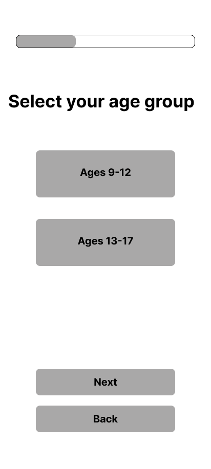
As I had to design something without having an established palette nor a pair of guidelines, I wanted to create something basic enough to get started. This would naturally be open for fixing, but for the time being this would be the very loose framework for the project. In particular, I wanted to have something that would suitable for 6-12th graders, and the goal was to have an onboarding process that was similar to most apps. The only aspect where this diverges is selecting the age group, as the app would then focus on delivering content based on that divide.


Feedback received 9/29
This was the first meeting with the Youth Advisory Board specifically about the frames, and it did help us get a better idea of what they wanted. We didn’t have a chance to get feedback from the profile page as well as the planned rewards page, but both of them weren’t as essential at this point; the focus was on getting established for when users first open the app.
-
Bright colors (for everything) but a few different ones for contrast
”A logo should be big and capitalized”
Medium sized mascot next to the logo
Confetti to greet you when you open the app; makes you feel like a hero
-
The second option is preferred
Location of the log in/sign up CTA buttons was liked
Introduction text says more/works better
Keep the text non-animated
-
Both think the multiple choice options are better and easier
Have questions focus on what you prefer to learn about, ex: “Do you care about saving plants?”, “Do you prefer to clean up the environment?”, etc.
Three to five questions max
-
They prefer to scroll down to select things
Overall thought frames didn’t need to be changed
Let users know exactly how many pages they have left
-
They liked the current iconography
Option #2 is liked better: it’s cleaner and is easy to understand
Just have the title of the mission, but also progress of it
Change “My friends” to “Friends”, and “Inventory” to “Items”
Frames after second YAB session input


Feedback received 10/20
Our second meeting was on October 20th, after a two week hiatus. This session focused on getting more feedback on the last few frames that would branch out from the homepage, as well as ascertaining the color palettes they would like to see within the app.
Frames after first YAB session input
Before the session

After feedback

These were the two options for the profile page I wanted to get feedback on. I modeled this off of Duolingo, as their version of the profile page is comprehensive without being too cluttered. Prior to the session, I was a bit uncertain what they might say regarding these included features.
Feedback taken:
1) Have the four tabs be on top of each other instead of having them bunched together in a group.
2) Combine achievements with the monthly badges.
Before the session

After feedback

Unlike the previous set of frames, I wanted to approach the feedback a bit differently: I wanted to see what I might need to change, instead of having contrasting versions. As they generally like the layout and page, all that was changed was the renaming “Personal records” to “Achievements”.
Same with the previous frame, I wanted to see what they would recommend to change. It might have been overconfidence on my part, but I figured that since I took their prior feedback, this page was essentially what they were asking for.
The two small pieces of feedback received were: 1) the look was appreciated, but make it possible to buy something here.
Feedback on the colors
At this point, we had a good idea of what the initial flow would look like, so the focus was on the aesthetics. I had five palette sets to show them, and what you see below are the two that they chose, with the lighter colors being the unanimous decision. It is worth noting that their choices are consistent with something brought up during the previous feedback session’s results: they wanted bright colors.

Feedback received 11/17
This session was primarily about getting feedback for the Missions themselves, so we were getting a bit ahead of ourselves; it was prompted by a survey sent out to the YAB and thus I wanted follow up on this. However, as the images below show, we did get some important discussions about the sections.
In particular, one helpful piece of feedback for the current UX/UI was to “improve to Achievements page to be less boring”.
Before the session

After the session

They said that both the “Next” and “Back” buttons should be the same color.
A “Chat” button should replace the “Statistics” one.
They liked the points system, but thought that it could be helpful to have the greyed-out sections be explained; they didn’t have any issues understanding it though.
Feedback for Missions and Rewards
-
Saving animals by giving them food
Over 2-3 missions
Reward: in-game currency for your character
Reward: new ocations, costumes, characters
Water plants that are dying
Help the environment
o Spread knowledge about the environment and/or trivia
Start school recycling challenges
Create short social media posts about an environmental issue
Do cleanups from the ocean, parks, etc.
-
Badges or discounts (i.e. a gift card for restaurants)
EX: The animal you saved is on a badge
Challenge badges: “planted ten trees this month”, “helped save [amount] of animals”, etc.
Rewards for daily streaks, i.e. two months, a year, five years
Would like to be able to post these badges on social media
Levels or points
Real-world shout-outs
Unlock new avatars
Wants for missions:
Multiple choice -> give more options
Interactive options -> something similar to Duolingo for the environment and/or video game progression
Feedback received 12/1
Continuing on with what was discussed from the last YAB session, the goal was to essentially finish off what we had before addressing the Missions page. This was admittedly a bit of filler while the team was getting ready to delve into the flows, but there was enough content to tweak at this stage.
Flow
At this point at the start of December, I had more than enough concepts in mind to create the general flow. Having asked the YAB about what they wanted/expected for the app (as well as taking the four personas into consideration), I knew I had to make the process of getting started as quick and easy as possible. What’s seen below is the preliminary flow.
